temporarily closed - we'll be back in 2025!

welcome to the blog
Welcome to Part 1 of the Wedding Stationery Makeover Series! I’m going to be giving my wedding stationery from 2017 a big makeover, and I’m sharing my process with you, from inspiration to print!
A little backstory:
I started learning calligraphy back in 2015 so that I could someday make my own wedding invitations. (For more on how I got started as a calligrapher, check out this blog post!)
Well, with 1.5 years of calligraphy experience, minimal knowledge of vectorizing, and ZERO stationery knowledge/experience, I did it! I designed the invitation and RSVP card. I created a “monogram” on a belly band to tie it together and addressed the envelopes with my calligraphy.
And it was NOT good.
I mean, it was definitely a good try for my first attempt, but I look back on it and chuckle (and maybe cringe) a little bit. It still means so much to me that I got to take the skills I had learned and put them to use toward the goal I wanted to achieve. And I absolutely cherish those because of what they announced and what they mean to me and my husband!
But now that I know a lot more about calligraphy and stationery, I want to give it all a little makeover. I want to use this stationery to do two things that I believe all wedding stationery should do: tell our story and leave a lasting impression.
So here are the different pieces of stationery and signage that I used for my wedding! (Jenna Greenawalt did an amazing job capturing these and making them look much better than they actually were – bless her. Also, I’m still in love with my wedding shoes. Thank you, Kate Spade.)
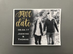
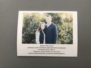
Our save the dates (front on top, back on the bottom)
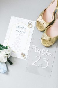
Our program and one of the table numbers. (And the best shoes ever.) (Photo by Jenna Greenawalt Photography)
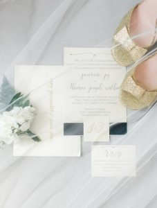
The invitation suite with envelope, invitation, RSVP card, and monogram on belly band (and the shoes again) (Photo by Jenna Greenawalt Photography)
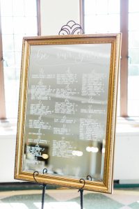
Our seating chart on this fabulous gold framed mirror (Photo by Jenna Greenawalt Photography)
What I love:
- The amount of gold – It’s minimal and not over the top with just the touches on the envelope, the monogram, the save the date, and the program.
- A little mix of modern and classic – I may have gotten a little confused along the way, but I do like how I made some pieces feel more traditional while bringing in some modernity. (I’ll get to what’s missing here in a second though.)
- It was really representative of me at the time – The shimmer paper, the marble on the programs, the calligraphy style. It shows the beginning of my calligraphy journey, and I absolutely love that.
- The acrylic – I still LOVE how acrylic can be used throughout a wedding. I’d still totally do that today!
- The seating chart – Even though I did make a mistake on the listing of our guests, I love that mirror so much! I think it was a perfect way for us to display where our guests were to be seated. It went with a lot of the other pieces of our reception and helped tie things together within that space.
What’s missing:
- Cohesion – Pretty much nothing about this whole set of stationery/signage goes together. It’s disjointed and each piece stands alone instead of working together to tell our story.
- The style – I really got confused about how to bring together modern and traditional styles. The program is so modern while the invitation suite is a little more traditional. I also hadn’t developed a great traditional style of calligraphy yet, so that made things seem a little more confusing.
- Representation of us as a couple – One of the things I love is that it was representative of me, but I think that it’s missing a representation of us as a couple. It’s not telling our story or showcasing who we are. It’s “pretty” things thrown together, which is pretty much my style.
- The little things – Oh, the little things. Those little design elements that show I had no idea what I was doing. The black vignette-like part of the save the date isn’t even. The calligraphy styles don’t match throughout. The gold ink on the shimmer paper is difficult to read if the light hits it right. The font I used for the invitation is way too big. And what are those bracket things on the top and bottom of the invite and the RSVP card? Who knows!
So what’s next?
Inspiration!
In part 2 of this series, I’m going back to my Pinterest boards and analyzing the words and feelings associated with my inspiration. I’ll also dig into the questions that I ask all my couples as I get to know them!
I’ll be back next week with part 2!
With joy,
Jasmine
